Sumall
10/2014 - 05/2016
SumAll
SumAll is a democratic analytics tool that allows users to view all of their data across platforms, in one simple, easy-to-use visualization. Understanding and shaping that data in order to create an intelligible result for users was my first task at SumAll.
Today, I’m working on a sophisticated interactive visualization tool that will allow users to play with their data in a new way. Analyze and watch out for the user experience at SumAll on a daily basis.
Data visualization report
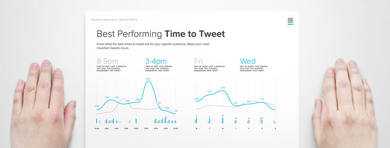
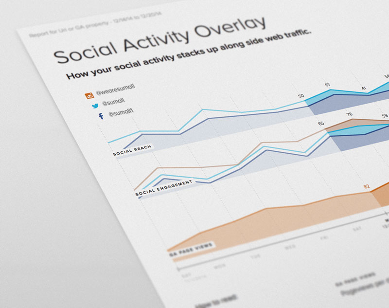
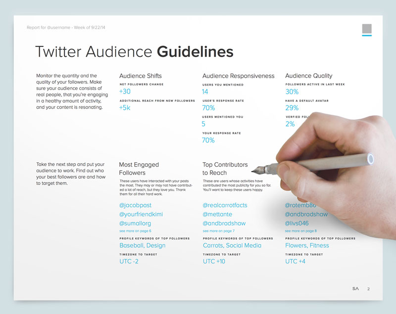
When I joined SumAll, the user interface was a list of data sets, from which users created their own charts, selecting their own comparison metrics. To make that easier, the first feature I designed was the Weekly Report.
Weekly Reports are pdf documents that reflect the entirety of a user’s activities and traffic on Facebook Pages, Twitter, Google Analytics and Instagram. They are designed for social media managers, who might otherwise struggle to copy, paste and organize raw data sets into spreadsheets and PowerPoint presentations. SumAll’s Weekly Reports offer a polished, consistent and ready-to-use analytic in terms of content and graphics.
Collaborators
Lema Kikuchi Luca de Rosso Tina GongTools
Adobe Illustrator CSS HTMLThe Process
Designing the Weekly Report, I met with data analysts and engineers to understand what to show and how to keep the data consistent and comparable across different sources. Once I identified the metrics, I thought about how to best tell the story to a user.
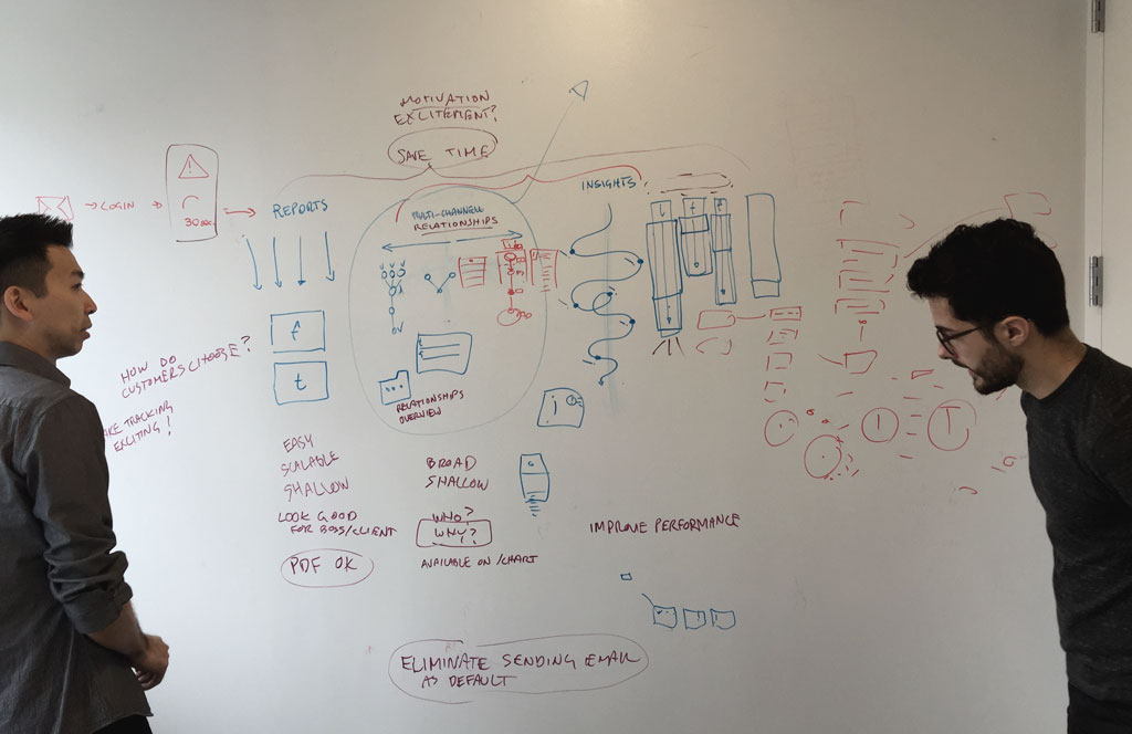
Restrictions were the most challenging aspect of this task: A letter-size sheet of paper doesn’t allow any interaction. In this limited format, we had to compare different periods and sources of data. The sale team’s role was important in figuring out how to do this, because I had the chance to receive feedback directly from users looking at prototypes interviewing users in pre-sale calls.
A new interface
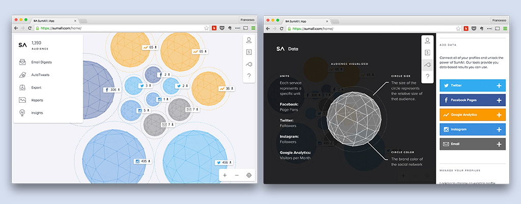
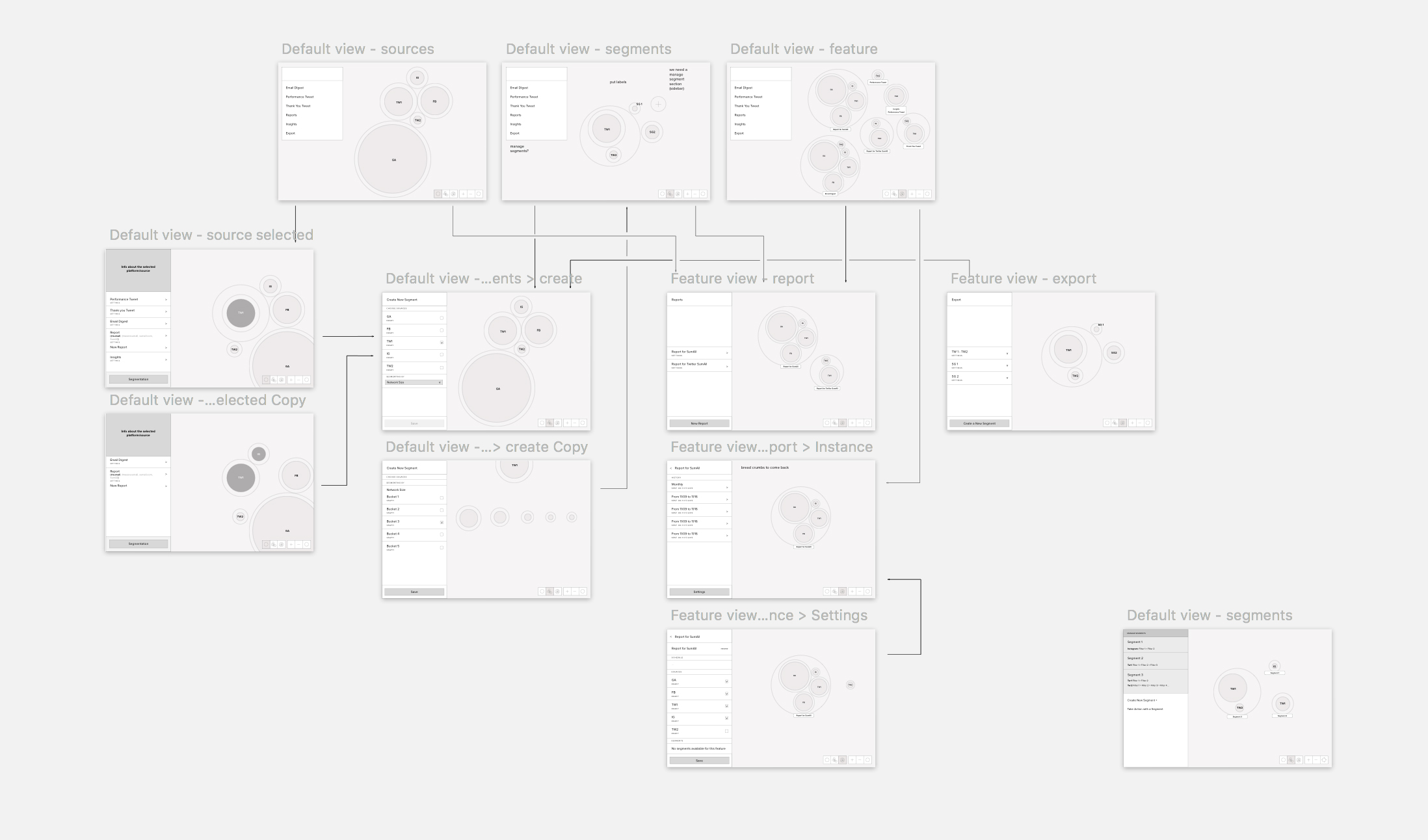
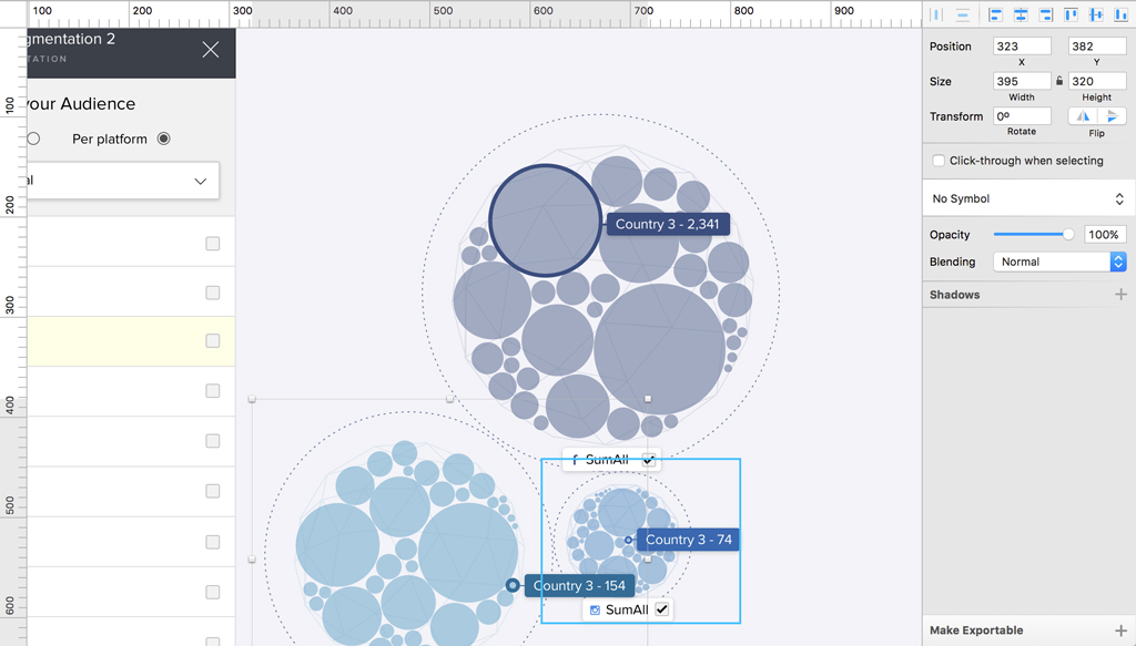
After a long time working with more than 30 connected services to offer users the broadest view of their data, SumAll decided to radically change the app experience. We decided to focus on “audience” as a crucial metric, and shrank the number of data connections to just the five most common social platforms. So the new interface changed to prioritize the circle graph. The size of the circles was defined by the number of followers.
Collaborators
Tina Gong Davin Chew Chris Jadatz Andrea BradshawTools
Sketch App CSS HTML vue.js a lot of post-itThe Process
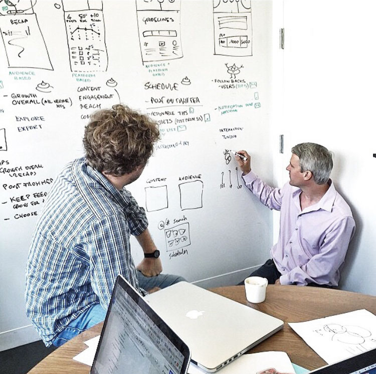
We tried to convert the data into “objects” to offer users a new way to interact with their data. The new design allows users to play with metrics, moving the circles around, panning and zooming on parts, segmenting sections, and drilling down into the details. From whiteboard to screen, the process was a non-stop back and forward. I immediately began to prototype different ideas in order to test interactions and the larger concept with the team and a focus group. In this case, chatting directly with real users was also fundamental in testing and improving the experience. Developing this further is what I do now.